
Simon Kuestenmacherさんのイラストまとめ
@simongerman600Follow @simongerman600さんをフォローする
フォロー数:215207 フォロワー数:264446


Following up on an earlier map with this one. China borders the most countries (8) with different alphabets. Source: https://t.co/8ohLp8iMaW
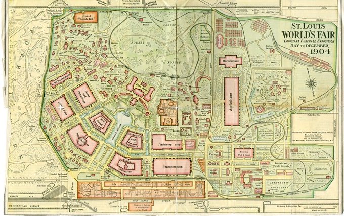
Map of the 1904 St Louis World Fair. Must’ve been an amazing event.
Map Source: https://t.co/wuuPVUUfcq
Wikipedia on the Fair: https://t.co/Srjn81cvyS

Bottom bar indicates Bible chapter. Books alternate in white and gray. Bar length shows number of verses per chapter. Each of the 63,779 cross-references in the Bible is shown as an arc. Color indicates distance between cross-referenced chapters. Source: https://t.co/37kqDebwXz

Map resizes nations based on the global Buckwheat production.
Map source: https://t.co/KfG7Oqikye
Why not read the full wikipedia article on buckwheat? https://t.co/jqNyqGQsmh
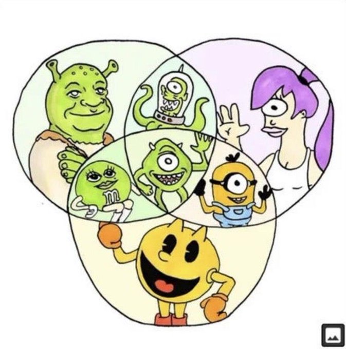
I love a good Venn diagram. Source: https://t.co/oBU4LF1SN1

"The Man of Commerce" by A.F. McKay from 1889 is probably still one of the most horribly forced metaphorical maps. It pains me to look at the thing. High-res version in the link: https://t.co/C2fQHa4lRR
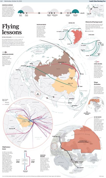
Cool map by @SCMPgraphics shows how geopolitical and safety concerns shape the flight paths of airplanes. It isn't a straight line you're traveling in. Source: https://t.co/GHK5Mn706B
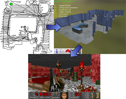
An automatic Roomba vacuum cleaner collects location data on its journeys through your living room. This genius wrote a script that turns these travel data into maps for the classic DOOM 3D shooter game. Doomba! Source: https://t.co/atsnJgn65K

Visually pleasing global life expectancy map by subnational divisions (2018 data). Source: https://t.co/IPciKgo9W9

Map shows the ranking of the Democracy Index across the Americas. Embarrassing results for the US. Source: https://t.co/3ur4htPJfL