
Simon Kuestenmacherさんのイラストまとめ
@simongerman600Follow @simongerman600さんをフォローする
フォロー数:215207 フォロワー数:264446


Map of the Principal Aquifers of the US. An aquifer is a geologic formation, a group of formations, or a part of a formation that contains sufficient saturated permeable material to yield significant quantities of water to wells and springs. Source: https://t.co/vafgbHr6ua

This map shows the most successful music artist from each European country. Not sure about the underlying data but it's fun to see how many artists you can recognize. Source: https://t.co/R2fGAL2veA

Awesome dataviz shows all 23 languages with over 50m native speakers and the countries where these languages are spoken. I think it's funny that Austria is missing in the German section. Great piece of work though! Source: https://t.co/vbU18sYOQo
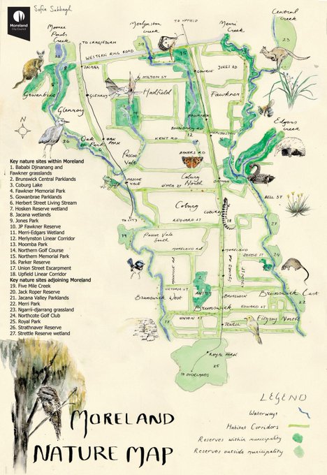
The document describing the biodiversity initiatives of my old council (Moreland in Melbourne, Australia) features a gorgeous hand-drawn map. Always happy when I see works like this being commissioned. Source: https://t.co/MVXb95KbVq

Map by @NatGeo shows the routes that famous explorers took around the world. Source: https://t.co/oMyV8U6K3J


Percentage of Americans with Polish ancestry by county in 2018. Source: https://t.co/4m1Z6pYtE8

Gorgeous minimalist flag map of the Americas. Source: https://t.co/O7heAZwzMm

Infographic show the sleeping habits of various animals. Dolphins put one half of their brain to sleep at a time. Giraffes almost don't sleep at all. Sea otters hold hands while sleeping. Source: https://t.co/tRu6h713ra

This gridded population map of Australia shows just how dominant the five largest cities are. Source: https://t.co/yxKtdMCE1b