datavizのTwitterイラスト検索結果。 253 件中 7ページ目


May 17 #COVID__19 streamgraph UPDATE
• 7-day average holding steady at 4,604 deaths
#NewYork share of #USA total continues to decline
#Brazil records 800+ deaths for 3rd day in a row
Interactive chart...
https://t.co/YTOT7BLtou
#dataviz #ddj


Noise pollution in 50 cities — my latest #dataviz for @La_Lettura is now online! https://t.co/bsOhVuEdQQ
#Datavisualization #infographic #ddj


R. Ufficio Geologico - Carta geologica delle Alpi occidentali - Dedotta Dai Rilevamenti Eseguiti Gagli Ingegneri del R. Corpo Delle Miniere, dal 188 al 1906 - Roma, 1908
#arcgispro #blender #maps #gis #dataviz #geological #cartography #copernicus #geospatial #3dart #3dmodeling


Au carrefour des #datasciences et des #humanitésNumériques, un article pour découvrir la fouille de données textuelles ou #textmining et la visualisation de #données relationnelles via @CNRS #dataviz #Gargantext https://t.co/Xo25GZRjib


BLOG! 🎉 After almost a year I've written a new blog 😃 Read about the total data prep & analysis + design + creation + bloopers of my @NASAHubble #dataviz that I made for @PhysicsToday to celebrate Hubble's 30-year anniversary 🛰️
👇
https://t.co/dEbDiQA83A


Want to nerd out about #sciart, #dataviz, and more?
@LifeologyApp's new SciArt Reading Club meets once a month to unpack the science of effective visual #scicomm.
Join the conversation at: https://t.co/rNjyNxsmAD

Le capitali del rumore: un dettaglio della mia #dataviz per @La_Lettura sull'inquinamento acustico, in edicola questa settimana.
#vivalaLettura #datavisualization #infographic


Just got this personalized #dataviz #datacomic from my energy provider this morning :) Great to see more data comics out there: https://t.co/s27lRZ3YD6 Lots of exciting research ahead! @zezhong_w @cybunk @matteofarinella @DesignInf @CreateInf


I'm so honored to hear my name mentioned in @HarvardBiz podcast "After Hours"! Thank you so much Felix Oberholzer-Gee, @YoungmeMoon and @desaimihira for your kind words on my work.
https://t.co/xndDd7Q7Xt
They talked about my #dataviz for @sciencefocus, @sciam and @La_Lettura!


Our #GeoDataViz team's favourite geo data visulisations of 2019 included @Timmeko’s map of America’s weather and @jonni_walker’s powerful depiction of threats to sea turtles. What are your #favemaps of 2019? https://t.co/vXcJJWP5x0


NEW: Questions in Dataviz - How can we visualise decimal numbers? https://t.co/sWq70wQ55o where I solve the question to the Ultimate Answer, use the word "repetend" lots, and feature @LearnVizWithMe @nheilman @ChrisLuv

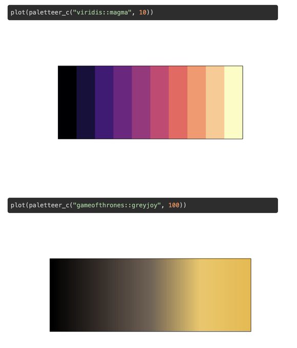
I'm happy to announce that version 1.0.0 of {paletteer} hit CRAN!
❤️💙💚🧡💛💜
- Easy to use interface with proper autocomplete 💓
- Instantly check your palette visually 👀
- Over 650 new palettes from over a dozen packages 📦
https://t.co/ntnQdYgpKW
#rstats #color #dataviz


An incredible detailed look at the unidirectional of
pulmonary airflow of the savannah monitor lizard using computational fluid dynamics simulations by @Wasatchquatch! https://t.co/Qcv3xSYabf #dataviz


I'm announcing an update to ggfree, my homegrown #Rstats package for making #ggplot2-inspired #dataviz with only base R:
ggfree now does trees!


De una vez por todas: ¿Qué es infografía? ¿Qué es 'data design'? ¿Qué es 'dataviz'? https://t.co/VlelIOfeuP vía @lagaussescuela #infografia #datadesign #dataviz #diseño #diseñografico #diseñoeditorial #educacion #informacion

Absolutely stunning work from @ian_bott_artist on one of this year's Seasonal Appeal stories about science vs wildlife poachers.
Fascinating article by @clivecookson
https://t.co/p6SUfDnFRl
#dataviz #ApplePencil #ipadpro


Global map of forest height made using @NASA satellites. #dataviz
https://t.co/7S4SgfoLxp