datavizのTwitterイラスト検索結果。 255 件中 8ページ目


De una vez por todas: ¿Qué es infografía? ¿Qué es 'data design'? ¿Qué es 'dataviz'? https://t.co/VlelIOfeuP vía @lagaussescuela #infografia #datadesign #dataviz #diseño #diseñografico #diseñoeditorial #educacion #informacion


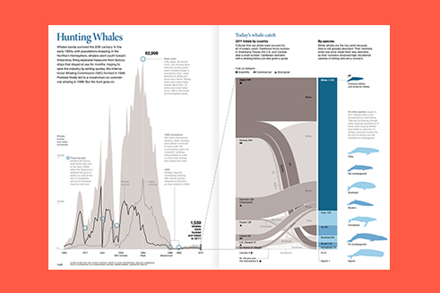
Absolutely stunning work from @ian_bott_artist on one of this year's Seasonal Appeal stories about science vs wildlife poachers.
Fascinating article by @clivecookson
https://t.co/p6SUfDnFRl
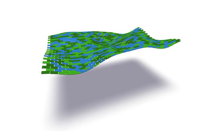
#dataviz #ApplePencil #ipadpro


Global map of forest height made using @NASA satellites. #dataviz
https://t.co/7S4SgfoLxp


This great diagram by the World Resources Institute @WRIClimate shows the sectors that contribute to greenhouse gas emissions.
The data is from 2005 though, does anyone know where I could get the latest data that makes up this image?
#dataviz #climatechange #globalwarming


Reposting @imagegardener:
Student artwork from my Image Garden workshop at CODAME Art +Tech Festival 2019 『 SPACE 』
#XR #Art #Tech #Workshop #Festival #Media #Dataviz #Sketching #AI #nonprofit #artist #learning #innovation #creativity #collaboration #codame

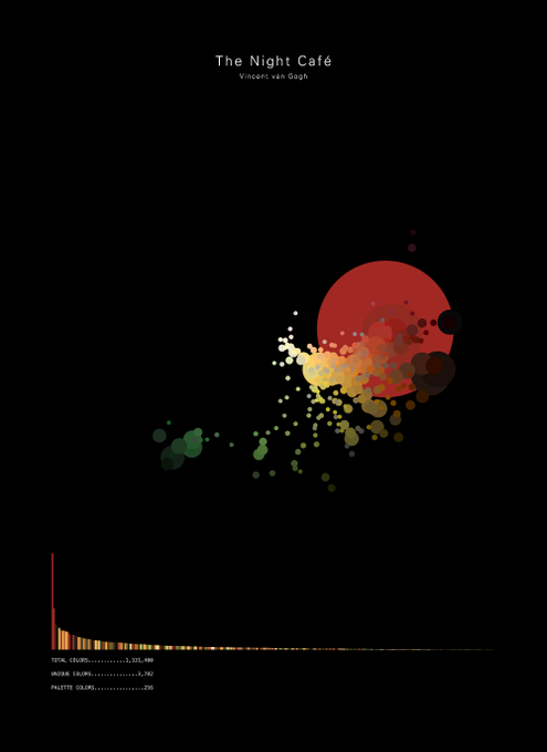

Awesome idea for a #dataviz. The visual shows an adaptive colour palette for a specific piece of art. Here we see van Gogh's night cafe. How great is that!? Source: https://t.co/qOp8lxLhoJ


New work! Visualizing @here XYZ data with @mappingmashups @mizmay & Sarah Fortune #dataviz https://t.co/xrMmCeu3zu

Coloring #Paris' roads by designation. #dataviz
More cities + #OpenSource code at https://t.co/jUJkMm5uRs


😍😍 I'm just going to spend the whole weekend playing with #Ghibli-themed colour palettes for my plots. Bless you creative souls out there. Any other movie/tv/story themed color-palettes to check out?
https://t.co/ddJr8Mrpot #ggplot2 #dataviz


Illuminating the world's nuclear test sites. #dataviz #Blender3d #Map


Must-read thread by @lieaplz!
Mei-Li Nieuwland may well be creating a new modern form of communication combining journalism, activism, #DataViz, cartoons in a unique powerful way.
What’s a good name w/ OpEd, toon, twitter?
LiTwitoon?
OpLitoon?
Meitoon? https://t.co/qY09E3u6HE


Visualizing the global scale of American whaling 1790-1900 using 400,000 ship's log entries. Data from @whalingmuseum and @mysticseaport #dataviz #Map


ICYMI: As @DataVizSociety is stepping up its activities and has launched its own publication *NIGHTINGALE*, hear the founders @MollzMP @AmyCesal @Elijah_Meeks discuss what the society is for & why the #dataviz community needed new channels for debate: https://t.co/ZjriZILSx9


Ever wonder what the various #dataviz tools look like as people? And need stickers of them? Check out #datavizsociety member @eolay13’s shop!
https://t.co/cmY1bm907J


Not a huge basketball fan but I love the dataviz of @kirkgoldsberry in #Sprawlball (can only recommend it!). I tried to replicate some of his figures with #rstats. The originals can be found here: https://t.co/FCf3OKvOay (1/3)


"Sailing Seas of Plastic" This interactive #dataviz and #map gives a sense of how bad plastic pollution in the ocean is. As a species we need to be responsible with our waste management. Source: https://t.co/yzk2lwuZ3v


The Awesome R Gallery of Graphs: https://t.co/RBsw78SJBH
******
#Rstats #Statistics #DataScience #Coding #DataScientists #DataViz #VisualAnalytics #DataLiteracy #DataStorytelling #BeDataBrilliant


Are you a #scientist whose #research has been improved by #sciart? In what ways?
#scicomm #dataviz #graphicalabstract #illustration
#art Carol Donner from Bloom et al. 1988


Meet #DataVizSociety member Will Chase (@W_R_Chase), data scientist at Upenn researching epidemiology of tuberculosis in Africa, focusing on dataviz. He works mostly in #rstats & is currently learning #D3js. In his spare time he also makes generative art.
https://t.co/mJYTKJL7dv