typographのTwitterイラスト検索結果。 317ページ目


I really like the old typography, roswellian airbase theme, and 40’s/50’s visual style of 90’s era foo fighters. somehow it just suits the music


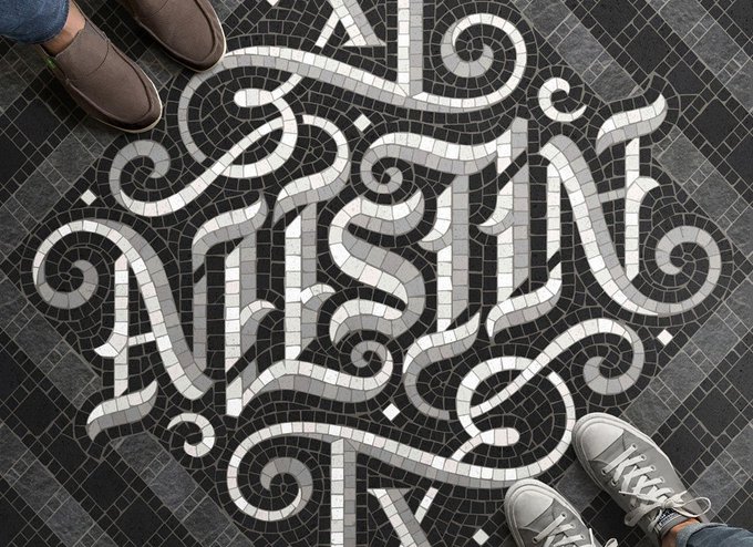
40 Clever Ambigram Logo Designs That Work Upside Down! https://t.co/yzU80YDIRC
#LogoDesign #typography

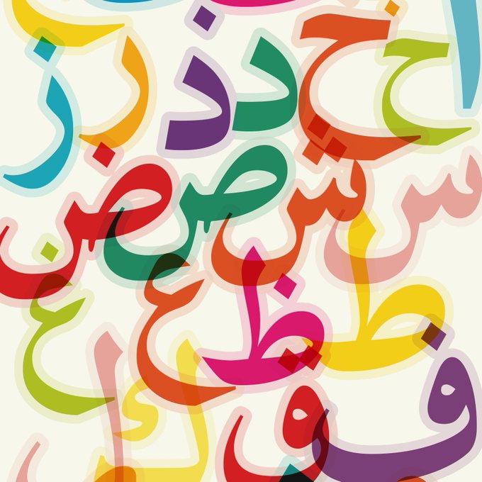
Using colour, layering and transparency to experiment with Arabic letters. At what point does the information become illegible
.
#typography #type #Arabic #arabicletters #letters #Friday #Fridayart #art #artsy #artist #hustle #artistsoninstagram #leicester #leicestercity #magic

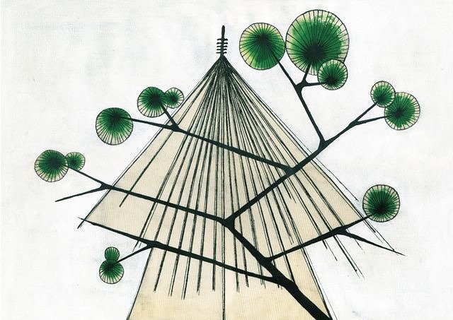


Amherst College Class of '68 50th Reunion Book Cover. Color by Laura Martin. Typographical Blandishments by Kim McQuaite.
Attended my 50th college reunion last weekend. Had a fantastic time. I did the cover for the reunion book, filled with reminiscences from my classmates.


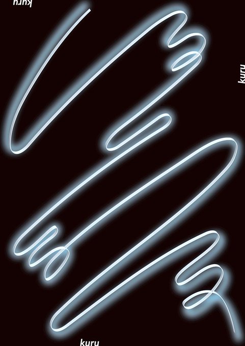


アイ・チョー・クリスティン 霊性と寓意(2018年)のフライヤーをアーカイブしました!2018年8月19日(日)まで金沢21世紀美術館で開催中。
#design #フライヤーアーカイブJP #チラシ #デザイン #flyer #typography
https://t.co/JgUHmn1obN


This experimental typography is by graphic designer @fatihhardal3
As a personal project, the designer wanted to explore creative effects such as blurs and burns which would integrate into his posters. What do you think of his designs? 💡🖌


Typographically tasteful quotations & aphorisms at https://t.co/waXbtIJOEt


A colourful illustration for España! #illustrations #illustration #Illustrator #bull #Espana #Spain #travel #travelblogger #travelling #typography #Creative #designer #aoi @theaoi #colourful
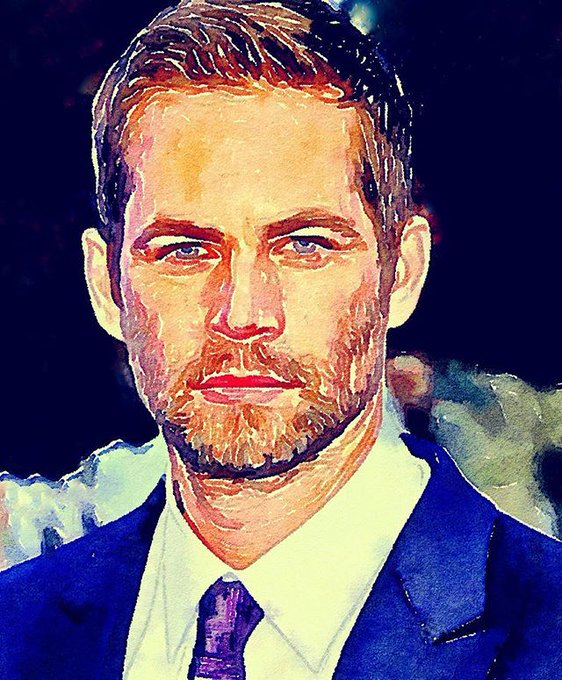


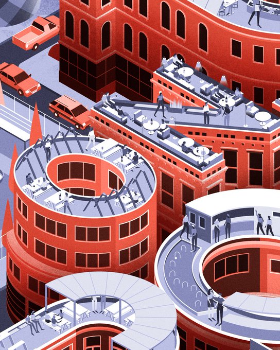
Our cover #illustration for @timeout London. #MUTI #editorial #lettering #typography


Medieval illuminated script page for class with a #Thor theme ❤️ #marvel #typography #graphicdesign #pagelayout
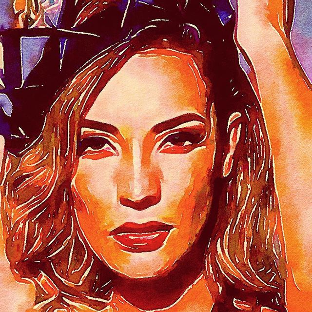

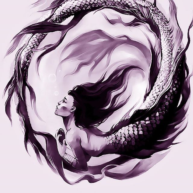
Label artwork for a 2007 Cabernet Sauvignon
My artwork was chosen for the new CURVATURE WINE by golf celebrity Cristie Kerr, which she created to raise money for breast cancer research.
https://t.co/RC9xBA3Ilm
Layout and typography by Olivia Choi, Du… https://t.co/yQw89tiWbr


Here's some lovely typography #Design #Inspiration -- A collection of inspiration and useful resources for any task, every day - via https://t.co/Txl0z8ZsRo https://t.co/l6Y2Rl3JRd