typofonderie.comさんのイラストまとめ
@typofonderieFollow @typofonderieさんをフォローする
フォロー数:611 フォロワー数:10936


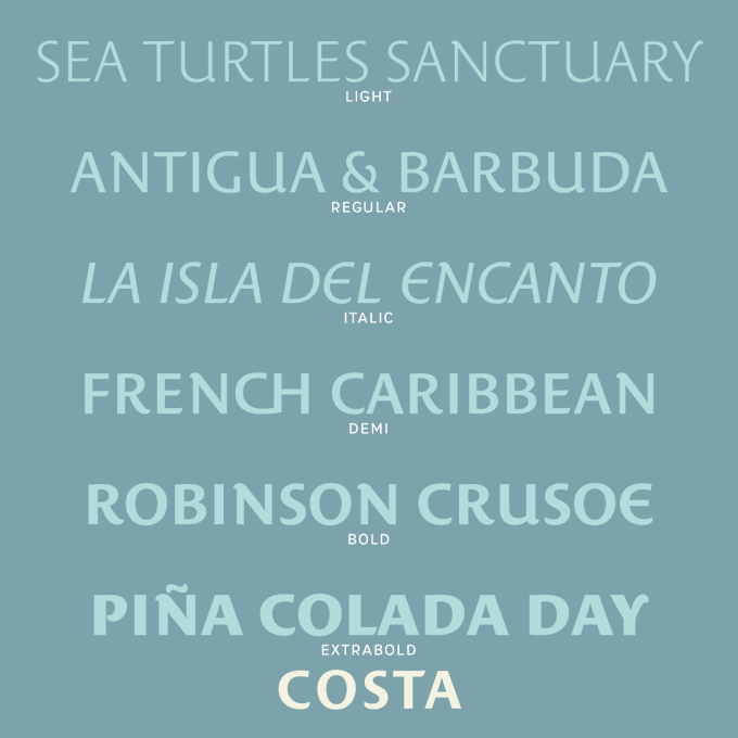

The original idea of Costa was to create a contemporary mediterranean style. Anytime you’re looking for good mood, qualitative effects, informal tone, cool atmosphere without to be unconventional or blowzy, Costa will convey to your design the right tone
🏖️https://t.co/3b7BHWRm8a


One of the ideas of Anisette Petite is to incorporate non-typographic details that are found in the lettering of posters and signs. It's not easy to accept an inconsistency when designing a typeface that you want to be consistent!
https://t.co/0YsGMv2mcL


One of the ideas of Le Monde Courrier is to play up the surprise effect with certain serifs in order to improve letter recognition, such as C and G. Nothing very scientific, just visual! Rounded low contrast fonts are pleasant to read on screen. https://t.co/qbaHESHjsZ
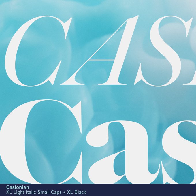


I am unable to define which one is the real Calson. With that in mind, I might as well let my imagination run wild. Be influenced by some of the uses of Caslons in the 70s. That’s the short summary of this project, which is currently being finalised. @jfporchez


👋Font pairing of the week:
1. Le Monde Livre Classic / Le Monde Sans
2. Arteria Compress / Mencken Text
3. Ambroise / Ysans
4. AW Conqueror Inline / Le Monde Courrier
❓Which one is your fav?


There is something very nice about Mislab, it is the surprise to see the s or c that seem to come from a Sans. Because unless you look at them closely, the open shapes fit perfectly. The advantage is that Mislab is in fact more open-legible in a small size than a usual slab.


The dilemma between letting one's imagination run wild from one master's to the next, and doing everything to assert one's own identity according to the weight? What changes? Certainly the style, and also the proportionality between the various constituent elements of each glyph?


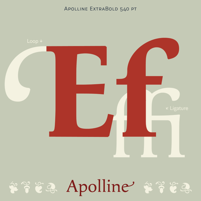
Apolline is not a revival but rather a study of Renaissance script and the transition to typographic form. What to retain from the calligraphic ductus, pressure? How to establish a typographic model inspired by the multiple variation of written forms? https://t.co/GbNSLJwGDl


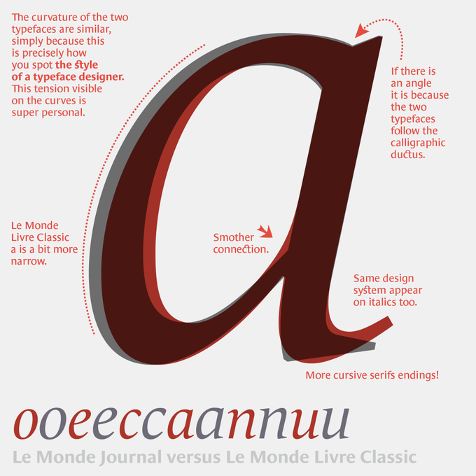

You know these two typefaces, but less in a finer comparison. The challenge of a super family is to establish common principles and structure, while looking for the difference: those nuances that will help the contrast. Le Monde Journal, intended for small sizes, is the base… 1/


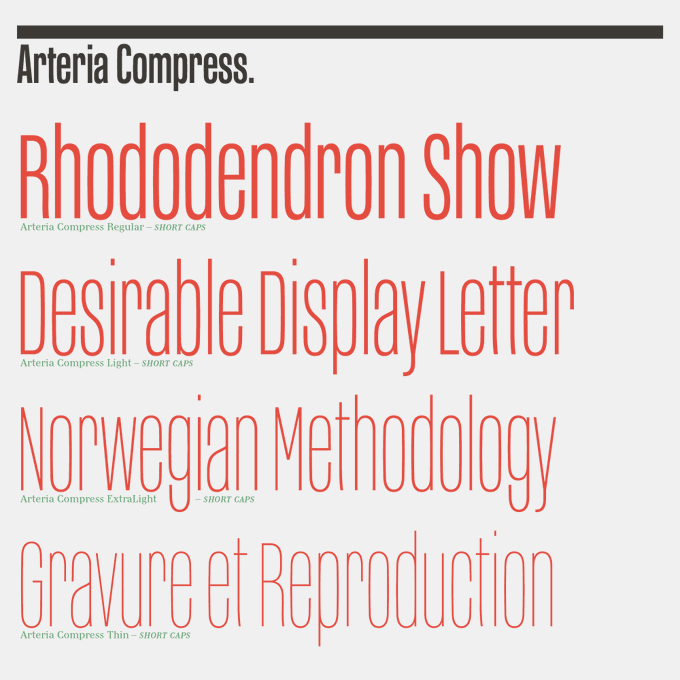
The whole weights of Arteria set in capitals is already good. But using short capitals with lowercases is even better and visually more fun. https://t.co/gmZieplR87
➽ Arteria Pro, 259 glyphs: from € 55
➽ Free Try-out version available