typofonderie.comさんのイラストまとめ
@typofonderieFollow @typofonderieさんをフォローする
フォロー数:611 フォロワー数:10936


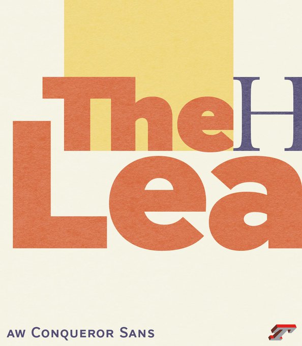
AW Conqueror Sans is a serious sans serif that is easily transformed in both romans and italics, thanks to Swashes. Switch is easy via OpenType features. Using AW Conqueror Sans on a daily basis means the empowerment to propose different tones.
➽ https://t.co/CbrlcnGpLS


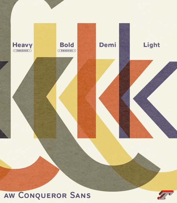
AW Conqueror Sans, as homage to English modernism is available in 8 weights, roman and italic, which perfectly match well with AW Conqueror Didot. They both share a common glyph set including swashes (1040 glyphs).
https://t.co/CbrlcnGpLS
➽ AW Conqueror Sans, 16 styles.


💥AW Conqueror Sans in both romans and italics features swashes capitals and minuscules, forms usually associated with Renaissance italics, such Arrighi in La Operina, a writing manual in 1522. The swashes forms are available via contextual OpenType.
https://t.co/CbrlcnGpLS
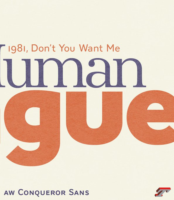


AW Conqueror Sans, as homage to English modernism is available in 8 weights, roman, italic, which match well with AW Conqueror Didot. They both share a common glyph set including swashes (1040 glyphs). This variant of “a” is present in both families, etc.
https://t.co/CbrlcnGpLS


Looking at lettershapes in a mirror is probably the most revealing thing about learning to draw type, or rather to see the shapes, the regularity of counter-forms and forms.
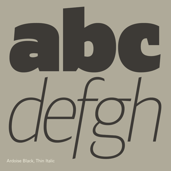
— Ardoise https://t.co/Cie5hXC4Iw A straightforward sanserif in 45 fonts, 4 widths


AW Conqueror Didot, 31 December 2021
https://t.co/xtf1R5R7r8
— — —
#newyear #happynewyear


Testing and re-testing a typeface (here Le Monde Livre) in unexpected combinations in order to verify the overall coherence. Beyond the weights, serifs, it is the spirit of the forms in their totality which marks a style. https://t.co/IatbPFLGtL


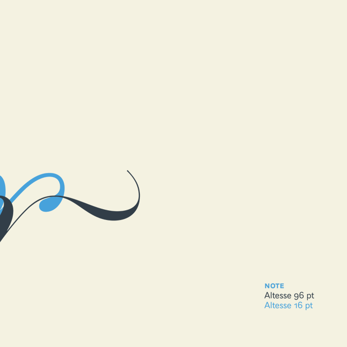
Amour.😍 The 16 pt versus 96 pt version of Altesse. In addition, some OpenType features added to the 96 pt.
https://t.co/OWPfBxcou2


You know Le Monde Journal, and the great readability in small size that accentuates the relief of each glyph. But did you notice that the punctuation are huge compared to the descenders? https://t.co/JO5GEHbcLi


Literally R5$B3€ffjá!ffjè?wzwzfastlost. This is the daily life of type designers, writing anything. Today, set in our new Didot on the way.