typofonderie.comさんのイラストまとめ
@typofonderieFollow @typofonderieさんをフォローする
フォロー数:611 フォロワー数:10936


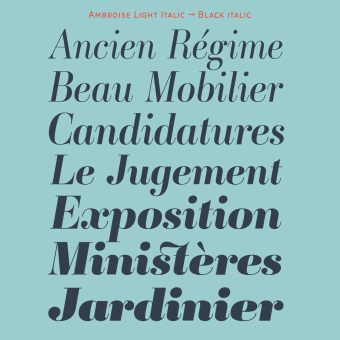
Ambroise is a classic of digital typography. It represents undeniably the Didot à la française, with a certain contrast but not too much, in order to make it usable. Three widths, multiples weights, italics, various alternates & fleurons: Read about it https://t.co/alz9CeyWgn


What if the visual identities of the Olympics were all typography and color? Exercise from 1964 to 1997: Set in Arteria Compress Bold, Ardoise Narrow ExtraBold, AW Conqueror Inline (not as good as the original), "60s Sans" Demi.


Since it is the period of the Tour de France, it is the opportunity to test the Airco, which makes a slight nod to the scripts of the 60s.
➽ Airco https://t.co/optYRvjFrV


➽ Retiro Pro is available in 5 optical sizes and offers 1100 glyphs. Via multiple OpenType features combined to infinity, the Retiro offer to your graphic projects a unique typographic identity, but never austere because “multiple” and full of life. https://t.co/nSpIsbRMNz


Drawing typefaces before the arrival of computers probably had an interest, it is that the extraordinary long time to draw, then to finish it according to very established stages, allowed to take time to think, to observe the forms and counters. (set in AW Conqueror Stencil)
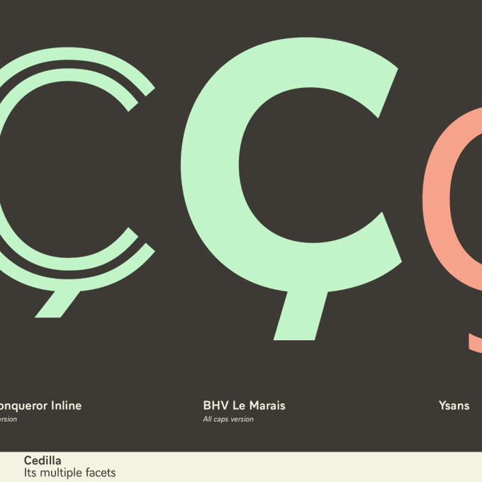
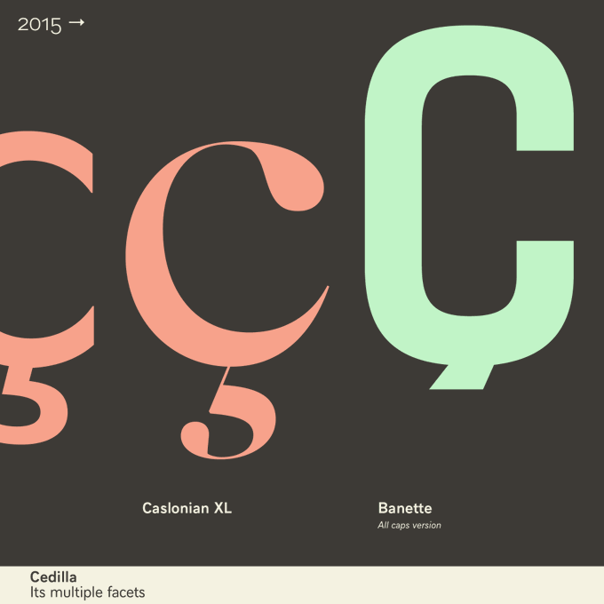
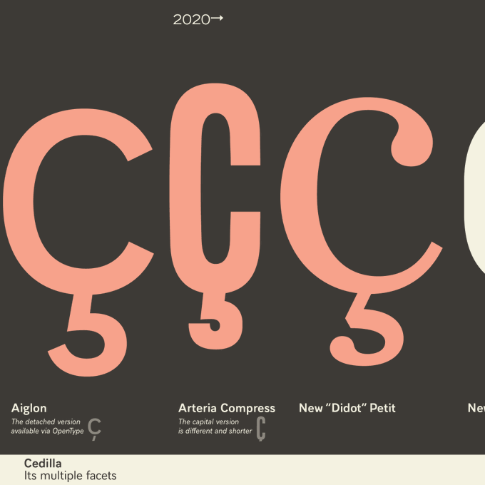

👀2. Cedilla (as well others diacritics) There is no absolute rule that would make such a form illegible that would not fit into the aesthetic canons of this or that. It’s not an exact science, a simple matter of taste.
➺ https://t.co/1HLlvyUKcO
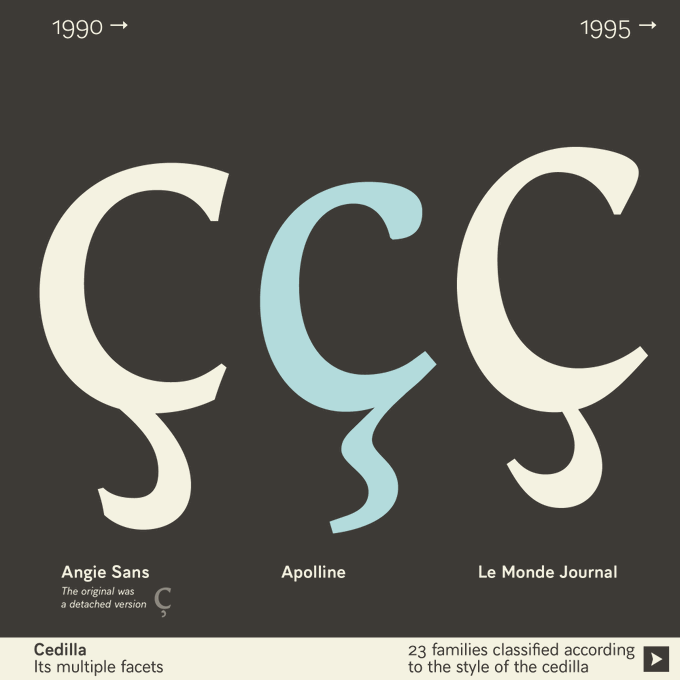
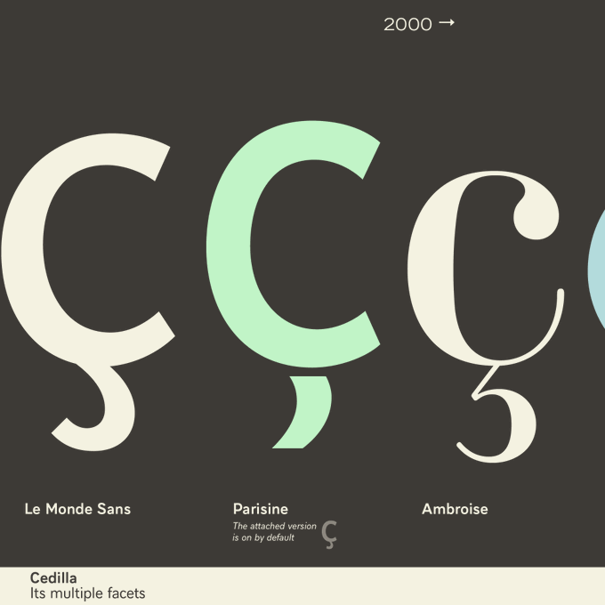
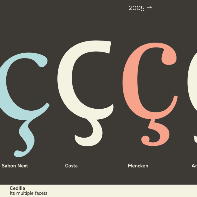
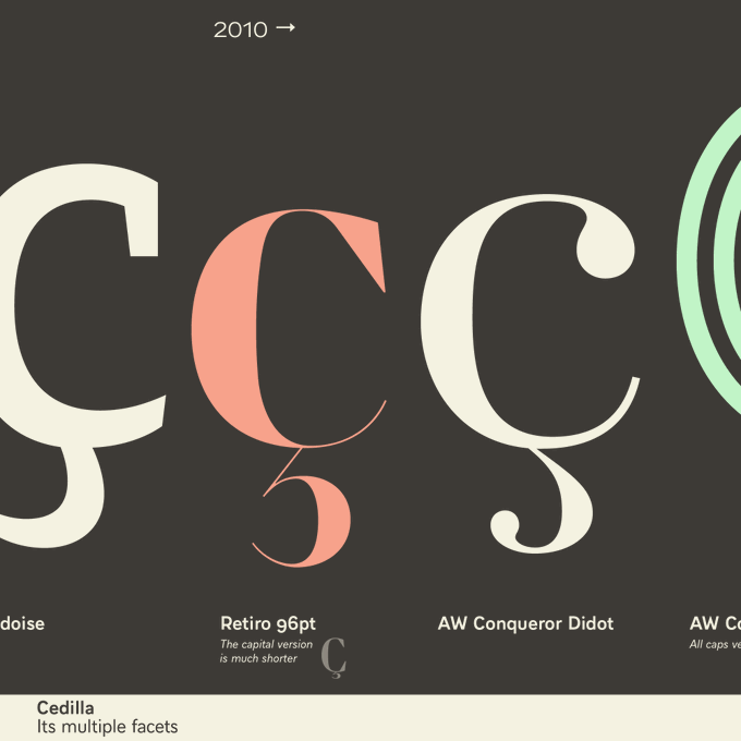
👀1. For years, the debate about the correct form of this or that diacritical mark has been raging among type designers. Behind this debate, there is a desire to do better, to share good practices.
➺ https://t.co/1HLlvyUKcO


Prosaic by @aurelien_vret — The influence of the tool, the brush is revealed in the letterforms above: angular counter-forms contrasting to the smoothed external shapes. Prosaic is super legible in small sizes, and visually attractive in headlines.
https://t.co/TePwpSc9uV


For decades the spirit of Didots is connected to the history of fashion, probably linked to the uses by Alexey Brodovitch in Harpers Bazaar and some others. Here is an example of usage and especially a comparison between the two most extreme optical sizes of our forthcoming Didot


"I thought allowed to draw y perpendicular, admitting only to its base a slight inflection to the contour and the final ear, almost like the head of f." Read about the Didot dynasty, evolution of type design production since 2000s: https://t.co/AtFqxdW4XI