typofonderie.comさんのイラストまとめ
@typofonderieFollow @typofonderieさんをフォローする
フォロー数:611 フォロワー数:10936


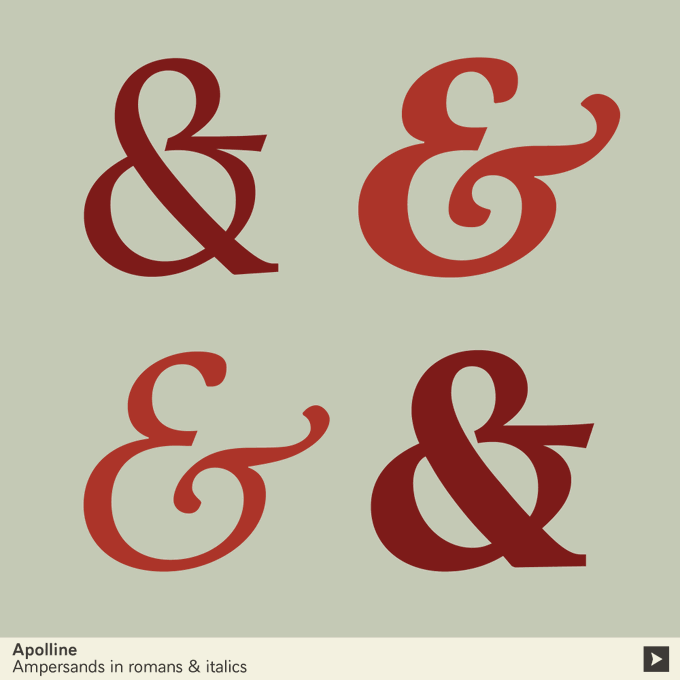
We are lucky in France, because the Latin conjunction et remains in use in French, so the ligature & of e and t is clearer for us. Drawing an ampersand is the cherry on the cake for any type designer! Here from our not yet launched Caslonian family.


Recent progress on our Didot. Only Affiche and Gros versions presented from this large family in 4 optical sizes. If interested, let us know via https://t.co/xwz1CUA3zP


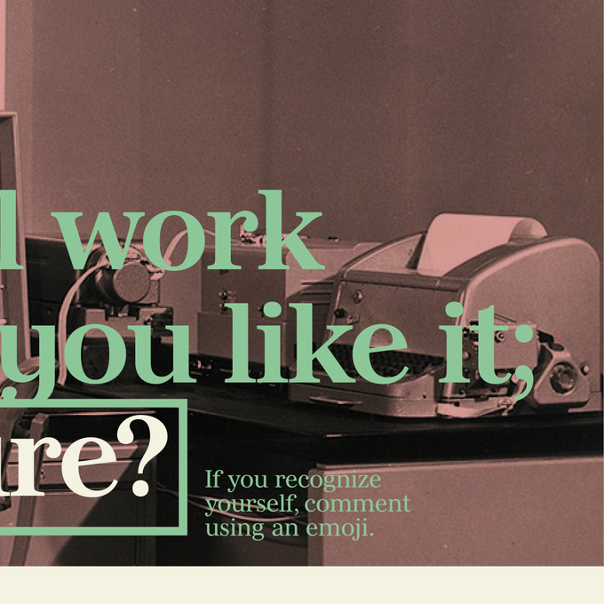
Are you those who still work on weekends because you like it; enjoy it, & just don’t care? If you recognize yourself, comment using an emoji.
Set in our forthcoming Didot planned in 4 optical sizes, hope that you will enjoy it!

Le Monde Courrier https://t.co/qbaHESHjsZ A rounded slab in 5 weights, romans & italics designed by @jfporchez. On the image, one of the two "g" available. 1/n

3/ to try and get in the same mindset as those exceptional designers during this pivotal period in the history of typography. Thus it's is an exploration of the design methods used by people like Jenson and his contemporaries for adapting handwriting with its multiple occurrences

Joyeux Noël! Enjoy the pleasure to be together even with a distance, give and receive much love as possible.
— @jfporchez
#christmas #noel


Beside @arabictype very good blog post who describe perfectly @FontLiBeirut aims to fundraise for victims of the #Beirut blast. ❤️🤍💚Please contribute and RT! We've collected €14000, it is fantastic but never enough. Last day 18 September 2020 https://t.co/fpW40Q8md9 https://t.co/6ieag59tAj

Bold and thick serifs make for strong impact in display uses while performing extremely well under the most stressful body text conditions. A slight cursive feel adds spice to the text while its delicate rounded rectangular structure is naturally adapted to screen displays.


➽ Le Monde Journal https://t.co/JO5GEHsNCQ
➽ Le Monde Livre https://t.co/IatbPG3hlj
➽ Le Monde Livre Classic https://t.co/VFs3REskbq
➽ Mencken https://t.co/PBhUOa0QPZ


Four optical sizes, multiple weights, in roman and italics. Interesting to see how the gradation of the weights works, more you’re heavy more there is a difference. We’re on it since 2015. But as today, the family is almost finished. #thread