DatavizのTwitterイラスト検索結果。 255 件中 10ページ目


#Dataviz narrative layers and #illustrations for The Map of Remote and Literary Islands: https://t.co/pMpo3cJhgD #infographics #datavisualization @La_Lettura


My new #dataviz for @La_Lettura is a visual exploration of the world of #MaryPoppins (and it's full of umbrellas! ✨☂️) #datavisualization #infographics


Actually I wanted to penplot them but turns out they look super boring on paper and much better with transparency & darker colors. So here are ~10h of takeoffs and landings at FRA,LHR,SFO & CDG 🛫 🛬
Data from @OpenSkyNetwork rendered with #deckgl
#webgl #dataviz


I have so many screenshots of in-progress 🌸s from my @SFMOMA project, and I just want to share them with you bc I love them and I think they're really pretty ☺️
🔗 https://t.co/f8K7mndDqJ
📚 https://t.co/m1HGeplp86
📖 https://t.co/8aq1P2Dbrd
#dataviz


YAY thank you for all the 💕 for my @SFMOMA #dataviz 🎉
I've put up a (super?) thorough ✨technical✨ write-up over on @datasketches so if you're interested please check it out → https://t.co/pKIfHhYit1
For preview, here's my fav #wip 🌸s & trying to figure out basic math:


Awesome illustration from the super talented @GrahamParrish on how clever crows are. Fascinating article from @FinancialTimes @clivecookson https://t.co/65gycXpSXo
#dataviz

Can't wait to pick up a copy of today's @FinancialTimes to see this on the front page of House & Home!
#dataviz #ddj #gistribe

3D MAP showing the explosion of luxury apartments that are reshaping Manhattan’s skyline, leading to a glut of prime property. Great article by @hugobriefly and @FinancialTimes’ @GeorgeNHammond
https://t.co/0yS8oY0vQm
#gistribe #dataviz #ddj

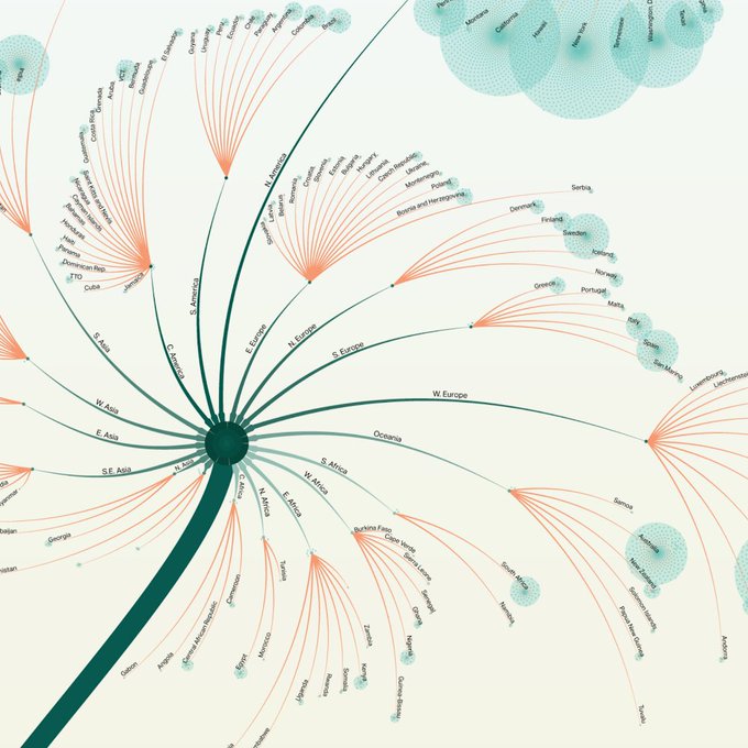
Where did the #MeToo Movement spread?
Explore the full #dataviz
https://t.co/9bAIckWDPt
#graphics #graphicdesign #metoomentum #d3js
I've reached 3,000 followers! And I know it's not (that) much, but I wanted to use this moment to thank the people who – sharing my #dataviz works – also helped me in my freelancing activity! Being on Twitter really brought me great opportunities, so thank you very much 🌸


28 of 100 #infographics way before they were so popular: Augustus F. McKay designed the earliest anthropomorphic map of the United States (1889). #100daysofinfographics #maps #dataviz


🗺 bubble grid maps w/ #rstats code:
🐄 "The Herds of Europe" ✍️ @maartenzam
https://t.co/fx7nldO8MQ #dataviz #maps

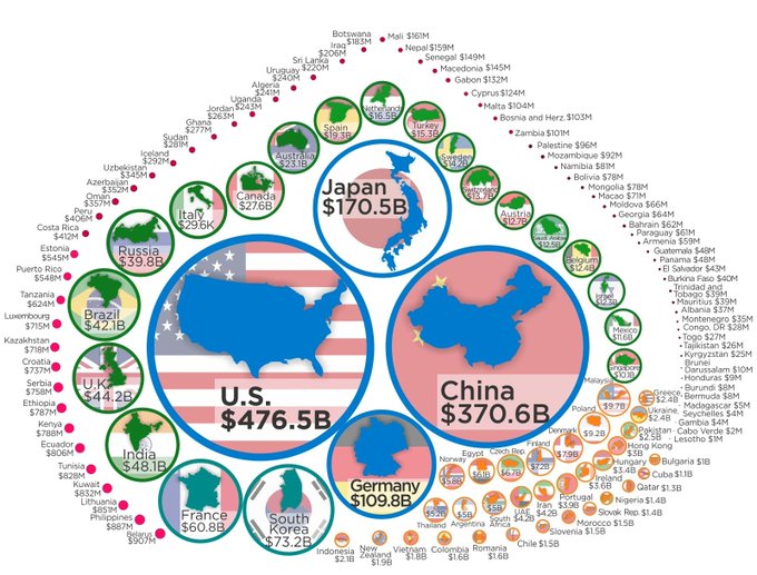
#Dataviz by @howmuch_net shows how much countries spend on Research & Development. This is a very important measure as "knowledge work" becomes increasingly important. The link allows you to download the data by the way... Source: https://t.co/xlvUmQFbUq


Amazed by our #dataviz workshop students' projects! Working with them was such a pleasure, we had a great week at @unirsmdesign! @francesco_majno #infographics #datavisualization

I just can't get enough of the talented @ian_bott_artist’s technical illustrations, another cracker in this @FinancialTimes piece on Airbus’s A400m military aircraft. #dataviz #Aircraft
https://t.co/CBna0lYTaj


Astonished that this is an exhibition in the Design Museum. A true triumph of style over substance https://t.co/wPPzhH4QL4 #dataviz
e.g apparently this chart shows what people tweet about political leaders.
o rly


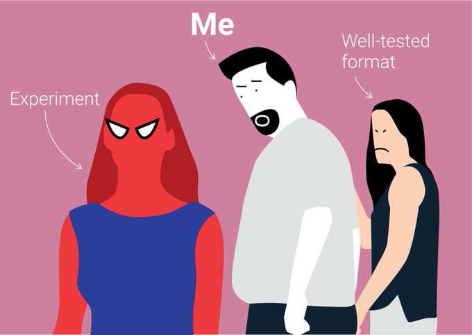
Classic, 😂 & true- #dataviz must-read!
“Look (what you made me do): I illustrated 10 of my professional sins” by @xocasgv
https://t.co/uMBfmzBT5u


MAPS: Custom azimuthal equidistant projections to compare world's longest flights. Great teamwork with @FinancialTimes @martinstabe, awesome artwork as ever from @ian_bott_artist #gistribe #dataviz
https://t.co/8nUPwQGCsi