matplotlibのTwitterイラスト検索結果。 38 件中 2ページ目


Where do the world's CO2 emissions come from? This map shows emissions during 2019. Darker areas indicate areas with higher emissions. Day 27 of the #30DayMapChallenge This map was made with #Python / #matplotlib. #DataScience #Data #DataVisualization #ClimateAction
#Climate

3D digital elevation model of Taiwan for day 19 of the #30DayMapChallenge - Islands.
This map was made with #Python using #Numpy, #matplotlib and #earthpy. #data #DataScience #data #dataviz #DataScientist #geography #artwork #art
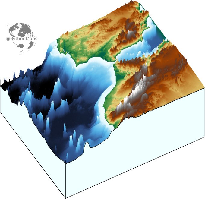
3D digital elevation model of the strait of Gibraltar for day 11 of the #30DayMapChallenge .
This map was made with #Python using #Numpy, #matplotlib and #earthpy. #data #DataScience #data #dataviz #DataScientist #eu #geography #artwork #art #Gibraltar #Brexit

Topography map of the greatest country in the world... Ireland. Colours correspond to the national flag obviously.
This map was made with #Python using #Numpy, #matplotlib and #Pandas. #data #DataScience #data #dataviz #DataScientist #Ireland #eu #geography #artwork #art

Contour line map showing the topography of Great Britain. Zoom in!
This map was made with #Python using #Numpy, #matplotlib and #earthpy. #data #DataScience #data #dataviz #DataScientist #uk #gb #eu #geography #artwork #art


OSM art is awesome art! This one uses the prettymaps Python library by @marceloprates_ that's based on osmnx, matplotlib, shapely and vsketch libraries.
Learn more about prettymaps at: https://t.co/KeKOIG2tP8
#openstreetmap #osm #art #osmart #python #prettymaps #opensource


marceloprates/prettymaps: A small set of Python functions to draw pretty maps from OpenStreetMap data. Based on osmnx, matplotlib and shapely libraries. https://t.co/6sqamqBJAY

Here are all of the rivers and waterways in Asia (excluding Russia), coloured according to the major hydrological basins they are part of. Zoom in! This map was generated using #Matplotlib #Numpy #Geopandas.
#Python #DataScience #Data #DataVisualization #Asia #China #India.

Mapping the world's flight paths.
This map shows 67,663 routes between 3,321 airports on 548 airlines!
Made with #Python using #matplotlib. #DataScience #DataVisualization #Travel #travelban #Map #COVID19

Where do the world's CO2 emissions come from? This map shows emissions during 2019. Darker areas indicate areas with higher emissions.
This map was made with #Python using #matplotlib. #DataScience #Data #DataVisualization #ClimateAction
#ClimateEmergency #carbonfootprint

What if the Roman and Mongol empires existed at the same time? Overlapping regions are shown in green.
This map was made with #Python using #matplotlib, #numpy and #pandas. #DataScience #Data #DataVisualization #DataScience

Where do the world's ~1 billion sheep live?
This map was generated with #Python using #Matplotlib, #Numpy and #Pandas.
#Data #DataScience #dataviz #geography #livestockfarming

Major railway lines in #Europe coloured by country. Zoom in!
This map was made with #Python using #matplotlib and #pandas. #DataScience #Data #EU #DataVisualization
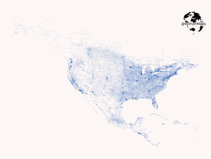
Vroom Vroom. Today’s map shows the public, tarmacked roads of North and Central America. Zoom in! This map was generated with #Geopandas, #Numpy and #Matplotlib.
#USA #Python #Maps #DataVisualization #Data #DataScience. 1/2

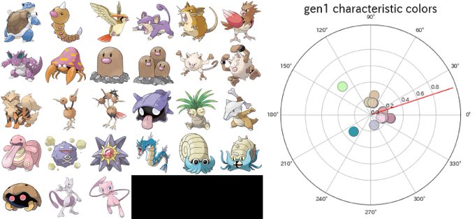


These images show the characteristic colors in each generation and Pokemon having these colors.
Each gen Pokemon have slightly different colors.
Next I wanna prove that new gen Poke`s color become vivid and colorful.
gen1 - 4
#Pokemon #matplotlib


