DatavisualizationのTwitterイラスト検索結果。 65 件中 3ページ目


Where do the world's CO2 emissions come from? This map shows emissions during 2019. Darker areas indicate areas with higher emissions.
This map was made with #Python using #matplotlib. #DataScience #Data #DataVisualization #ClimateAction
#ClimateEmergency #carbonfootprint

What if the Roman and Mongol empires existed at the same time? Overlapping regions are shown in green.
This map was made with #Python using #matplotlib, #numpy and #pandas. #DataScience #Data #DataVisualization #DataScience

Major railway lines in #Europe coloured by country. Zoom in!
This map was made with #Python using #matplotlib and #pandas. #DataScience #Data #EU #DataVisualization
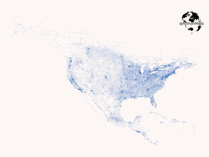
Vroom Vroom. Today’s map shows the public, tarmacked roads of North and Central America. Zoom in! This map was generated with #Geopandas, #Numpy and #Matplotlib.
#USA #Python #Maps #DataVisualization #Data #DataScience. 1/2


Hello, I emerge from the depths of applying for grad school/grants. I finally finished my Rshiny App showcasing the birds I have stalked all summer at @PointBlueConSci Palomarin field station.
Check it out here:
https://t.co/FCUkoeM9bl
#DataVisualization #scicomm

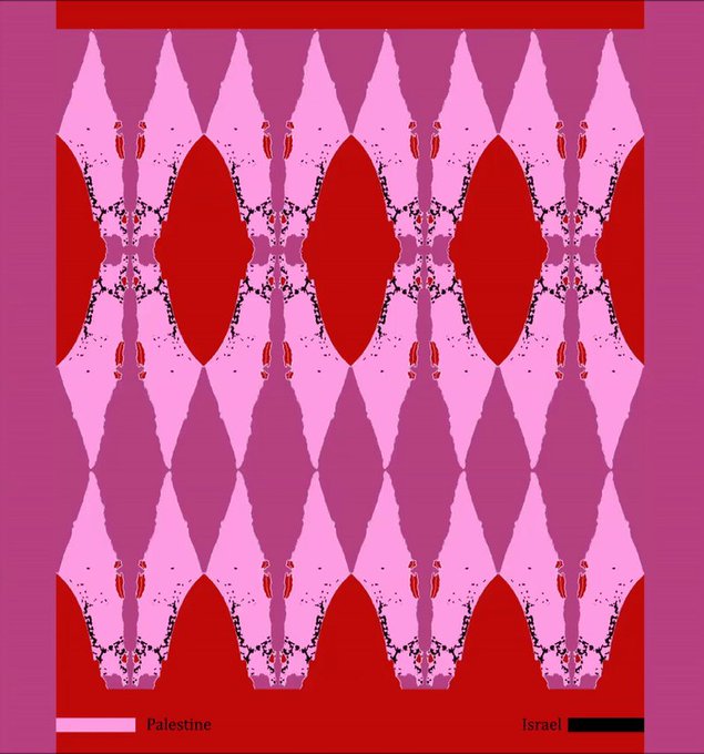
'1946-2012 (fregio)'
collage, animation
2020
maps from: https://t.co/KgRVkNeOQd
#GazaUnderAttack #DataVisualization #Israel #Palestine #occupation #map #gifart #cryptoart


Brains of the world. One of our graphics in the book The Zoomable Universe, by Caleb Scharf. Published by Scientific American / Farrar, Straus and Giroux #Infographics #dataviz #datavisualization #informationdesign #graphics #graphicdesign #visualization


Using #d3 from the basic Chord Diagram to a new form.
@NadiehBremer
@DataFestTbilisi #DataFest #DataFestTbilisi #ddj #DataVisualization


Noise pollution in 50 cities — my latest #dataviz for @La_Lettura is now online! https://t.co/bsOhVuEdQQ
#Datavisualization #infographic #ddj


The following data visualization projects by @MesaStudios, Andrew Baker, @HyperfineStudi1, Graham Studios, and @vega_asensio demonstrate how visual material can be used to help communicate a variety of scientific topics. Read More: https://t.co/GR8J2tLsTM #DataVisualization

Le capitali del rumore: un dettaglio della mia #dataviz per @La_Lettura sull'inquinamento acustico, in edicola questa settimana.
#vivalaLettura #datavisualization #infographic

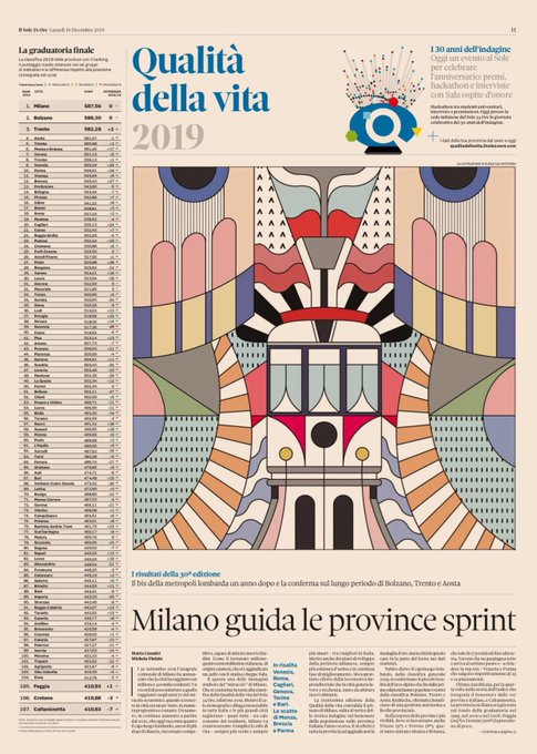


90 indicatori e 30 anni di dati. Torna la classifica di #Qualitàdellavita 2019 del @sole24ore, l’indagine che fotografa il benessere nelle province italiane.
Su carta e web, un lavoro #DataDriven con #Datavisualization top https://t.co/PLOwepeB1s


Hey all! I've created an article/data visualization on the appearances of X-Men over the past 56 years, inspired by the recent design work of @hellomuller and @JHickman. I hope you all enjoy! https://t.co/VYRh1hGIRI
#xmen #datavisualization #ineedajob


Hey #datavizsociety members check your emails for this special #Easter gift: data-driven eggs! Thanks to @martintelefont for the inspiration. #datavisualization


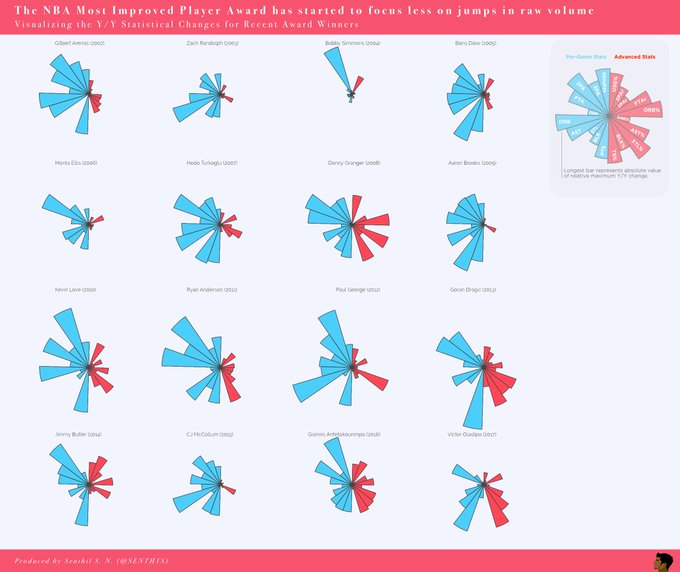
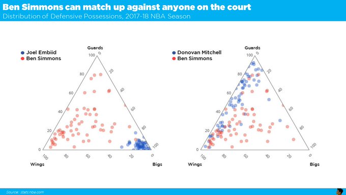
Meet #DataVizSociety member Senthil Natarajan (@SENTH1S), who combines data analytics and data science with visual communication across sports, startups and Fortune 500 companies. #sportsviz #Datavisualization


Meet #DataVizSociety member Guillermina Sutter Schneider (@gsutters), an Argie 🇦🇷 Data Science student based in Washington, DC! She co-authored a dataviz stylebook you can find at https://t.co/2ESA61DmCM and is passionate about best practices & terminology in #datavisualization.


La Visualización de Datos es el resultado de la combinación de Tecnología, Ciencia y Arte para conseguir contar una historia basada en datos fiables y contrastados. #visualthinking #visualnotes #datavisualization #visualizaciondedatos


Some details from my #dataviz for @sciencefocus: the #periodictable and the elements under threat. https://t.co/G2K6HwT06H The full printed #infographic will be on BBC Science Focus March issue! #Datavisualization


A portrait of our 1700 current members (badges based on your responses designed by Data Visualization Society founding member @AmyCesal). #datavisualization #datavisualizationsociety

Human rights violation and protection by country: a detail from my new #dataviz for @La_Lettura, out this week. #Datavisualization #ddj #Infographics