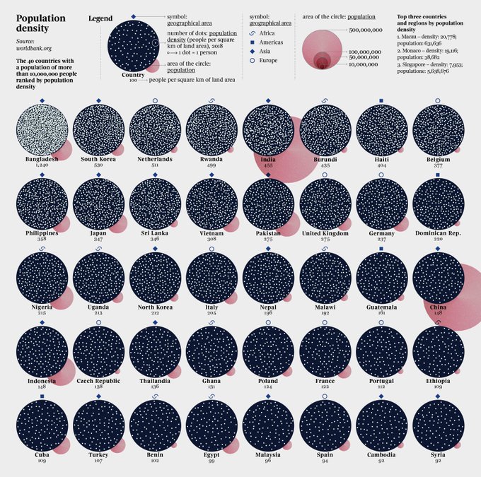
datavisのTwitterイラスト検索結果。 78 件中 3ページ目


【Bスタ】DataVisualizationもくもく会 2020/08/06(金) / https://t.co/9nvGldO5dB #エンジニア #イベント #駆け出しエンジニアと繋がりたい #エンジニア初心者 #エンジニアと繋がりたい


My projects for @la_lettura have been nominated for the @europeandesign Awards 2021 and I’m now finalist! Thank you!
#datavisualization #dataviz #infographic #ddj


Mapping the world's flight paths.
This map shows 67,663 routes between 3,321 airports on 548 airlines!
Made with #Python using #matplotlib. #DataScience #DataVisualization #Travel #travelban #Map #COVID19

Where do the world's CO2 emissions come from? This map shows emissions during 2019. Darker areas indicate areas with higher emissions.
This map was made with #Python using #matplotlib. #DataScience #Data #DataVisualization #ClimateAction
#ClimateEmergency #carbonfootprint

What if the Roman and Mongol empires existed at the same time? Overlapping regions are shown in green.
This map was made with #Python using #matplotlib, #numpy and #pandas. #DataScience #Data #DataVisualization #DataScience


[new stuff]
Datavis - OST
heading back to the portasound mines for a little bit of that discarded net yaroze nachtmusik
PSS-460 DL4(x2) MG10XU
it's got bleepies and bloopies and stuff!
https://t.co/j7UTtCCypb

Major railway lines in #Europe coloured by country. Zoom in!
This map was made with #Python using #matplotlib and #pandas. #DataScience #Data #EU #DataVisualization


Hello, I emerge from the depths of applying for grad school/grants. I finally finished my Rshiny App showcasing the birds I have stalked all summer at @PointBlueConSci Palomarin field station.
Check it out here:
https://t.co/FCUkoeM9bl
#DataVisualization #scicomm


🥳 New side project: The Colors of Jean Giraud — A homage the great comic artist #Moebius. He created many beautiful #comics like Blueberry or The Incal. I made a #datavis that explores how he used color through his stories and over time. https://t.co/8EUFXye2E9 #JeanGiraud

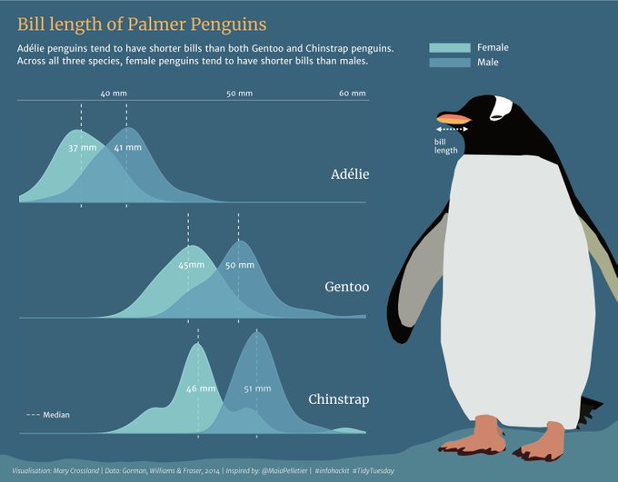
Recently joined the #infohackit online design course for researchers! Here's my first attempt at an infographic using a previous dataset from TidyTuesday - think my penguin is a Gentoo! Next stop, creating some visuals for my PhD research... #scicom #datavis

'1946-2012 (fregio)'
collage, animation
2020
maps from: https://t.co/KgRVkNeOQd
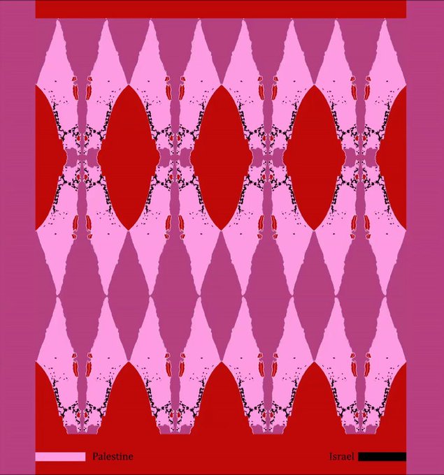
#GazaUnderAttack #DataVisualization #Israel #Palestine #occupation #map #gifart #cryptoart


Brains of the world. One of our graphics in the book The Zoomable Universe, by Caleb Scharf. Published by Scientific American / Farrar, Straus and Giroux #Infographics #dataviz #datavisualization #informationdesign #graphics #graphicdesign #visualization


Using #d3 from the basic Chord Diagram to a new form.
@NadiehBremer
@DataFestTbilisi #DataFest #DataFestTbilisi #ddj #DataVisualization


Noise pollution in 50 cities — my latest #dataviz for @La_Lettura is now online! https://t.co/bsOhVuEdQQ
#Datavisualization #infographic #ddj


The following data visualization projects by @MesaStudios, Andrew Baker, @HyperfineStudi1, Graham Studios, and @vega_asensio demonstrate how visual material can be used to help communicate a variety of scientific topics. Read More: https://t.co/GR8J2tLsTM #DataVisualization


Le capitali del rumore: un dettaglio della mia #dataviz per @La_Lettura sull'inquinamento acustico, in edicola questa settimana.
#vivalaLettura #datavisualization #infographic

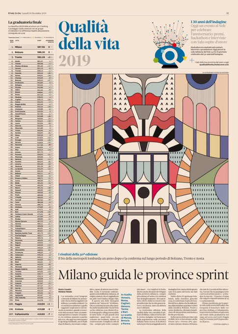


90 indicatori e 30 anni di dati. Torna la classifica di #Qualitàdellavita 2019 del @sole24ore, l’indagine che fotografa il benessere nelle province italiane.
Su carta e web, un lavoro #DataDriven con #Datavisualization top https://t.co/PLOwepeB1s

Queuing has been termed #Singapore’s national ‘pastime’ and ‘hobby’. But what exactly do we queue for? We poured through hundreds of @STcom headlines since 1990 to find out. #datavisualisation #dataviz #storytelling
👉👉https://t.co/pSChRWzA4y