datavizのTwitterイラスト検索結果。 256 件中 2ページ目


Out now: our latest Data Vis Dispatch! We collected the best #dataviz by more than 25 news organizations (and six individuals) from the past two weeks, covering everything from the floods in Pakistan to gas prices and baby names.
Find it all here: https://t.co/KerdfAIDmQ


Last but not least, a geo elevation tint of USA.
You can find it on vizcart shop (link in bio)
#usa #geography #maps #dataviz


On Thursday, I'll share my career journey in #dataviz as part of the @DataVizSociety #vizcareers series.
I've had a meandering path as an analyst, workshop designer, consultant, and manager that has taken me around the world. Join live & bring questions! https://t.co/elxZpYzmZh


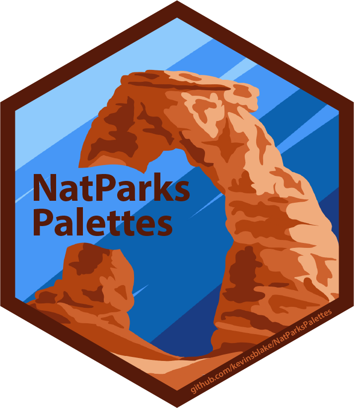
🌟 New R package 🌟
{NatParksPallettes} is a color palette package for R inspired by National Parks ⛰🏕🏜
Available on GitHub: https://t.co/ZaLwAQ9oPb
#r4ds #dataviz #RStats

All World #Languages in One Visualization 🗣️
https://t.co/PtZimx6Dun via @VisualCap
#Culture #DataViz
@JoannMoretti @enilev @Hana_ElSayyed @Shi4Tech @baski_LA @fogle_shane @NevilleGaunt @BetaMoroney @JolaBurnett @AkwyZ @Fabriziobustama @CurieuxExplorer @PawlowskiMario @mvollmer1


#Satellite #photography of
#NorthSea Isle of #Spiekeroog
False color urban layer 2022 - Red urban areas
#Sentinel2 #Copernicus #remotesensing
@sentinel_hub
@CopernicusEU
@CopernicusLand
#QGIS #OpenData #EarthArt #EarthObservation #DataScience #dataviz #OpenScience


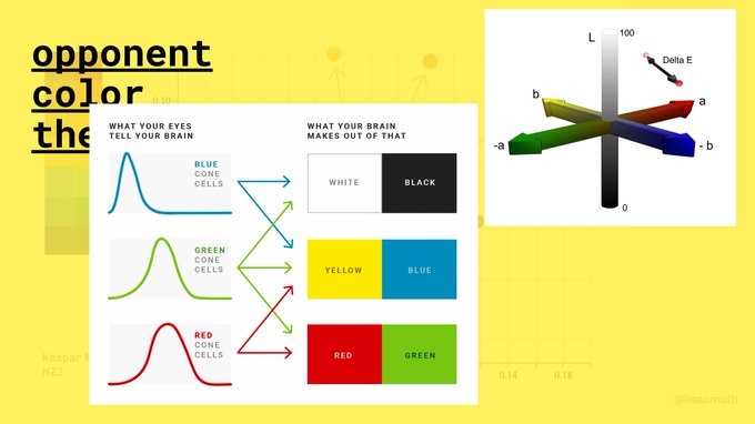
That's exciting: I'll give a 4.5h workshop about colors in #dataviz at #ISVIS2022 on Sunday, May 8th – my most in-depth color workshop yet!
Join us for lots of hopefully useful information (and help me to build a giant data vis color wheel): https://t.co/fiPqrL2Zk1


Mapping the world's flight paths.
This map shows flight paths in 2022 and was derived from ADS-B data.
Made with #Python using #matplotlib and #Numpy. #DataScience #DataVisualization #Map #shipping #Geography #dataviz #data #DataScientist


We just published a new Data Vis Dispatch! This week, you'll find more #dataviz about the war in Ukraine, as well as housing, consumer waste and much more.
Check them out here:
https://t.co/DBoNaQJRQR

Topography map of the United Republic of Tanzania.
The colormap goes black-green-blue-yellow from low to high altitudes.
This map was made with #Python using #Numpy, #matplotlib and #Pandas. #Data #DataScience #dataviz #geography #artwork #art #Tanzania


✨✨ PACKAGE UPDATE ✨✨
MetBrewer 0.2.0 is officially out 🥳 Available both on Cran and through my GitHub here: https://t.co/wYHMEKoJLH
New Palettes are out and some amazing new features. Full description of what has changed below :)
#MetBrewer #rstats #r4ds #dataviz

Population density of the British Raj if it existed today. The dark spots represent cities, can you name them all?
This map was generated with #Python using #Matplotlib, #Numpy and #Pandas.
#Data #DataScience #dataviz #geography #Humanity


Aleksandra Jovanić aka @alexis_o_O is the creator of the chromatlas and mid century modern series. She is a master of color and a dataviz illusionist ✨

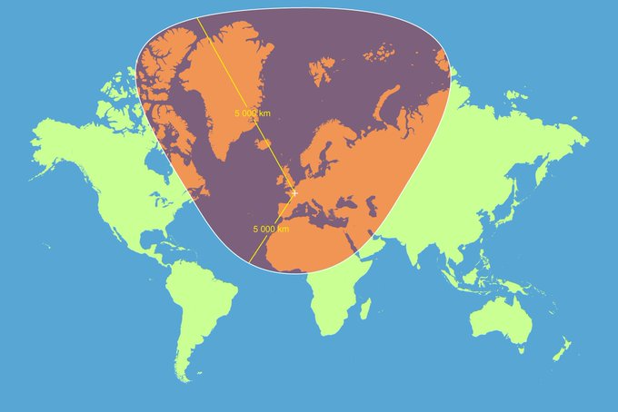
A circle with a 5000km radius centered on Paris with a Mercator projection. #dataviz
Source: https://t.co/RbpvTilzFJ


Happy Valentine's Day! #GraphEnthusiasts will appreciate this great diagram by @Kyoto_Aquarium showing the penguins' romantic relationships. As soon as we saw it, we fell in love 😍 #BeautifulData #RelationshipGraph #DataViz


Plusieurs manières de visualiser la répartition de la population mondiale en latitude. Les dataviz nous ramèneraient-elles au bon vieux déterminisme géographique ?
https://t.co/TNGfOAlxHM