DatavizのTwitterイラスト検索結果。 255 件中 4ページ目


Contour line map showing the topography of Great Britain. Zoom in!
This map was made with #Python using #Numpy, #matplotlib and #earthpy. #data #DataScience #data #dataviz #DataScientist #uk #gb #eu #geography #artwork #art


We published a new Data Vis Dispatch yesterday! It's our weekly collection of the best of small and big #dataviz. Have a look: https://t.co/AMWOTPgQGZ
In the thread 🧵below, I show screenshots of the four visualization-heavy articles that impressed me the most this week:


Examples of #ETH & #CAKE @CoinMarketCap data as #OpenSeaNFT #dataviz #creativecoding here: https://t.co/kEwAXOSlKX. That's the tweet.


Hi, I'm Fiona (aka Visualizing Science), visual #scicomm whiz ✨ I provide range of services from layout design to infographics to illustration. Making info accessible and understandable. #sciart #illustration #infographics #dataviz #layout #graphicdesign #creative #editor

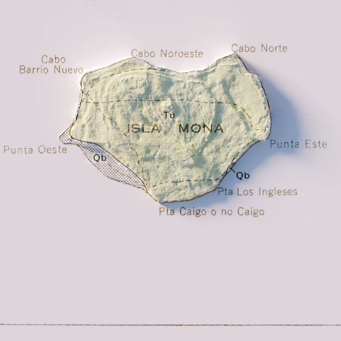

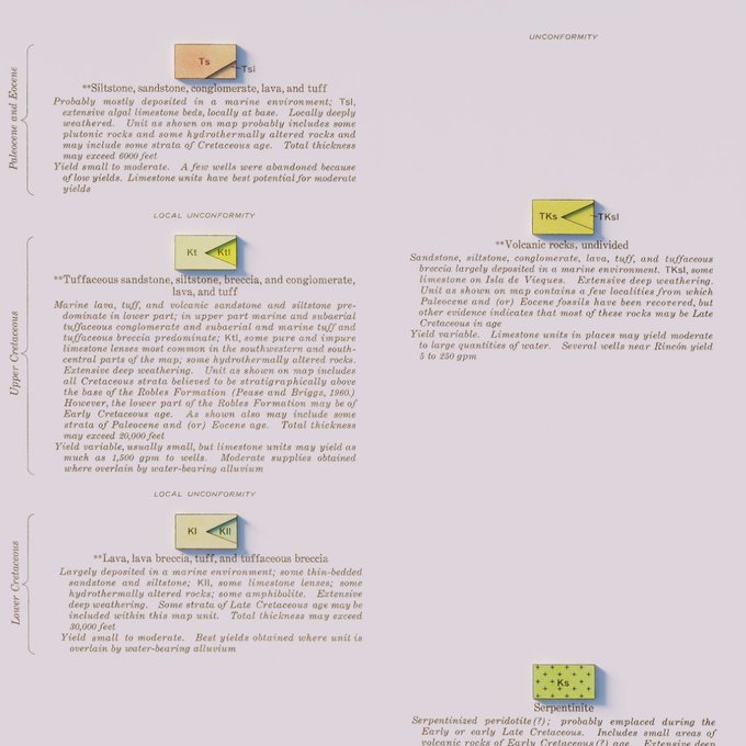
Hydrogeologic Map of Puerto Rico and Adjacent Islands - USGS - 1965
#arcgispro #b3d #PuertoRico #geology #geography #GIS #dataviz #cartography

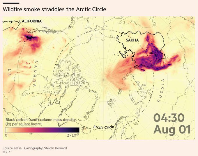
This week's climate graphic is on Siberian wildfires and how the smoke from these blazes straddled the Arctic Circle in August and led to the highest carbon emissions on record
Read @lesliehook's fascinating report
https://t.co/aAw3cZbf17
#gistribe #dataviz


Our latest Data Vis Dispatch is now out! Tune in this week for some interesting elections charts 🗳 coming from Canada, Argentina, Germany, Hong Kong, and California, some #dataviz on #covid19 🦠, and long term climate data:
https://t.co/xYklUchQ5M


Super fun team building at @fathomdata producing generative art. I used the {jasmines} package from @djnavarro to create:
#rtistry #dataviz #teambuilding


"World Stars"
New collection on @hicetnunc2000 based on a #dataviz showing how a country is doing (based on certain metrics).
I do seem to find myself often (always?) inspired by space for my visuals ;) 🌟
https://t.co/9xwR6r5nTf
#NFT #NFTart


Been playing with adding more than a dozen different color palettes to my Spirograph program over the past week. Here’s a peek at “antique”, “popsicle”, and “dark rainbow” (the latter being a palette which I use in my (dataviz) visuals for years now (not sequentially))


Great collection of interesting, recent visualizations.
Data Vis Dispatch, August 31 by @Datawrapper
https://t.co/BQpFvl8xdZ
#dataviz #statistics


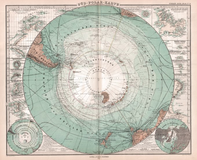
The frontier of the distant southern polar continent with notations for explorers routes, and surrounded by all those far flung islands of the nearby oceans. #oldmap #maps #dataviz #Antarctica


Join us next Tuesday for an @observablehq livestream about making waterlines in #Maps
⏰ Tues 27 July 5pm (UTC+1)
📍https://t.co/cEt69zA5Ae
#DataViz #Design
#DigitalHumanities #CulturalHeritage #MuseTech https://t.co/xtf5pWD6sc


This week's climate graphic looks at the record temperatures reported across the northern hemisphere on June. Data supplied by @CopernicusECMWF
Read @lesliehook's report
https://t.co/7jG1WYVfQb
#gistribe #dataviz #HeatWave2021 #ClimateCrisis


Thanks for the nice feedback, everyone! The second dispatch came out yesterday, full of interesting charts & maps: https://t.co/0OLwpNMDYs
(If you know where we can find great #dataviz from Asian/African newsrooms, please let us know. We'd love to make it more international.)