datavizのTwitterイラスト検索結果。 366 件中 2ページ目


In the last weeks our project Key Workers was selected for a STARTS Prize @arselectronica 2022 Nomination and my #dataviz for @la_lettura made it into the @dezeen Awards Design Longlist! Thank you for these recognitions to projects I care so much about.
#DataVisualization


The Average Sleep Patterns Of 40 Different Animals, Visualized | Digg https://t.co/20q6gsIUkV #design #infographic #dataviz #visualization


Out now: our latest Data Vis Dispatch! We collected the best #dataviz by more than 25 news organizations (and six individuals) from the past two weeks, covering everything from the floods in Pakistan to gas prices and baby names.
Find it all here: https://t.co/KerdfAIDmQ


Last but not least, a geo elevation tint of USA.
You can find it on vizcart shop (link in bio)
#usa #geography #maps #dataviz


On Thursday, I'll share my career journey in #dataviz as part of the @DataVizSociety #vizcareers series.
I've had a meandering path as an analyst, workshop designer, consultant, and manager that has taken me around the world. Join live & bring questions! https://t.co/elxZpYzmZh


Some of my teammates were at a Hackathon, talking about @observablehq ✨ They made a Notebook with rider data from NYC & London, I made them some illustrations to add!
You can see it here: https://t.co/DNP5ee6DC3
#DataViz #illustration


New followers over the weekend, hi! I am Kay, and I am a researcher/writer/cartoonist based in New York. My work focuses on #GraphicMedicine and I draw comics about social issues and inequities. I sometimes incorporate dataviz in my work. https://t.co/bKAv35Tydx


NEW! Audio Tales From The Border tells the story of three women forced to leave their country due to the war. Their voices become matter, with each ring representing a woman and her words. 1/2
#dataviz

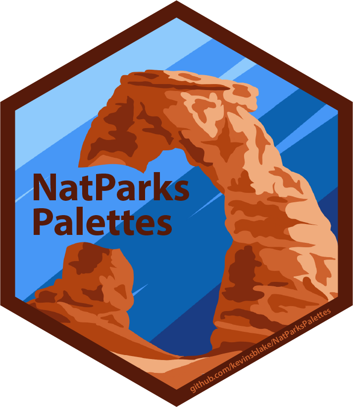
🌟 New R package 🌟
{NatParksPallettes} is a color palette package for R inspired by National Parks ⛰🏕🏜
Available on GitHub: https://t.co/ZaLwAQ9oPb
#r4ds #dataviz #RStats

All World #Languages in One Visualization 🗣️
https://t.co/PtZimx6Dun via @VisualCap
#Culture #DataViz
@JoannMoretti @enilev @Hana_ElSayyed @Shi4Tech @baski_LA @fogle_shane @NevilleGaunt @BetaMoroney @JolaBurnett @AkwyZ @Fabriziobustama @CurieuxExplorer @PawlowskiMario @mvollmer1


Shirley Wu (@sxywu) is one of my dataviz heroes.
In her #Eyeo2022 talk she'll tell a story about identity, burnout, finding courage, rekindling a dream, and settling into the discomfort of not knowing what comes next.
(Oh, and lots of dataviz.)
https://t.co/KkYUOKz9hF


Top googled countries, in different countries, as a network diagram. For instance, an arrow from Japan to USA means that people in Japan google the US more than any other country. Notice that no other country had China as their top target. #dataviz


#Satellite #photography of
#NorthSea Isle of #Spiekeroog
False color urban layer 2022 - Red urban areas
#Sentinel2 #Copernicus #remotesensing
@sentinel_hub
@CopernicusEU
@CopernicusLand
#QGIS #OpenData #EarthArt #EarthObservation #DataScience #dataviz #OpenScience


The second piece is "Time, Fire, House", about the words used to cover the Crimean War. This piece tells the story of a dreadful conflict seen through the terms used to document it in newspapers. #dataviz


That's exciting: I'll give a 4.5h workshop about colors in #dataviz at #ISVIS2022 on Sunday, May 8th – my most in-depth color workshop yet!
Join us for lots of hopefully useful information (and help me to build a giant data vis color wheel): https://t.co/fiPqrL2Zk1


Mapping the world's flight paths.
This map shows flight paths in 2022 and was derived from ADS-B data.
Made with #Python using #matplotlib and #Numpy. #DataScience #DataVisualization #Map #shipping #Geography #dataviz #data #DataScientist


We just published a new Data Vis Dispatch! This week, you'll find more #dataviz about the war in Ukraine, as well as housing, consumer waste and much more.
Check them out here:
https://t.co/DBoNaQJRQR

Topography map of the United Republic of Tanzania.
The colormap goes black-green-blue-yellow from low to high altitudes.
This map was made with #Python using #Numpy, #matplotlib and #Pandas. #Data #DataScience #dataviz #geography #artwork #art #Tanzania