datavizのTwitterイラスト検索結果。 268 件中 3ページ目

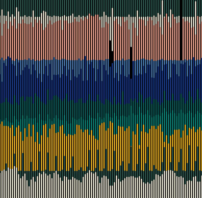
Prompt #22 - Genuary 2022: Make something that will look completely different in a year. Abstract animated visualization of Quality Air data in 2021 (SO2, FL_SO, NO2, O3, ...) from a station near home.
#genuary2022 #generative #generativeart #dataviz #p5js #ClimateCrisis #data


Piero della Francesca’s works — my latest data visualization designed for @La_Lettura: https://t.co/btAWL0beDh
#Datavisualization #dataviz #infographic #ddj


A blend between generative art and #dataviz using neural networks.
#genuary #genuary2022 #AI


Being obsessed with visual metaphors for years, I've slowly developed this brainstorming process to help come up with them faster for #DataViz, illustration, and infographic projects: https://t.co/fSqamgzIXX


Topography map of France. Colours correspond to the of the national flag. #TopographyTuesday
This map was made with #Python using #Numpy, #matplotlib and #Pandas. #data #DataScience #data #dataviz #DataScientist #eu #geography #artwork #art #France #Map


My new project is out! It’s a data visualization on Piero della Francesca’s works, designed for @La_Lettura. It’s in newsstands in Italy this week!
https://t.co/G0MW5xyCxG
#datavisualization #dataviz #infographic #ddj


#keplergl is a great tool when you want to quickly graph a geographic dataset without any code! 🔥
Just upload your CSV, Json or GeoJSON!
👉 https://t.co/pepFoSlgna
#geospatial #DataScience #dataviz


I don't have the coding skills to participate in #genuary2022 but I'm loving the submissions, learning so much new stuff and getting great #datavizinspiration. Today is all about Sol Lewitt's Wall Drawings - I'd never heard of him before but I absolutely love this!

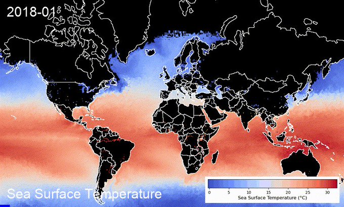
Happy New Year🎆 You can now create sea surface temperature timelapse with a colorbar using the #streamlit web app in <60 seconds 👇
App: https://t.co/LpcKK9yI6p
GitHub: https://t.co/ufznWiTnvs
#EarthEngine #geemap #eochat #gischat #oceancolor #dataviz #geospatial

Topography map of Kenya. Colours correspond to the of the national flag. #TopographyThursday
This map was made with #Python using #Numpy, #matplotlib and #Pandas. #data #DataScience #data #dataviz #DataScientist #eu #geography #artwork #art #Kenya #Africa #Map

I'm not rounding up my fave 2021 vizzes this year, but I do want to shout out the IMPRESSIVE work that Kontinentalist @konti_sg is doing. Their reporting is interesting and includes gorgeous illustrations and #DataViz😍 here's one of my faves...
https://t.co/rwC08GxaU4


Playing around with some of the Colorscape Data with @rawgraphs to make some #dataviz & #dataart

3D digital elevation model of Taiwan for day 19 of the #30DayMapChallenge - Islands.
This map was made with #Python using #Numpy, #matplotlib and #earthpy. #data #DataScience #data #dataviz #DataScientist #geography #artwork #art


Great map by @mapmakerdavid showing the world's 100 largest islands.
#dataviz #maps
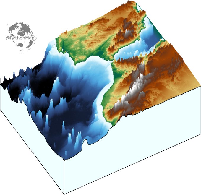
3D digital elevation model of the strait of Gibraltar for day 11 of the #30DayMapChallenge .
This map was made with #Python using #Numpy, #matplotlib and #earthpy. #data #DataScience #data #dataviz #DataScientist #eu #geography #artwork #art #Gibraltar #Brexit


Our Black in Data Viz lineup is straight 🔥 led by @ahobby9, @ajstarks, @IllestPreacha, and @SotiCoker!!
Register today!!! https://t.co/Wa9TtlJ4FN #BlkNData #DataViz #BlackTIDES #DataScience #DataAnalytics #BlackTechTwitter


Part4: Today it's time for relative humidity changing throughout the year.
Mean monthly relative humidity, calculated from #dewpoint and #temperature (1981-2020) #ERA5
created with #geemap and #EarthEngine.
The scale is non-linear for better #visualization.
#dataviz #EarthArt


Wes Anderson's new film @french_dispatch features most of the actors who appear regularly in his films!
My new @tableaupublic #dataviz shows his favorite collaborators + their roles.
Interactive: https://t.co/DDuZEXfHev
Thx @ShijiaWendy, @FlerlageKev, @flerlagekr for tutorials

Topography map of the greatest country in the world... Ireland. Colours correspond to the national flag obviously.
This map was made with #Python using #Numpy, #matplotlib and #Pandas. #data #DataScience #data #dataviz #DataScientist #Ireland #eu #geography #artwork #art

Contour line map showing the topography of Great Britain. Zoom in!
This map was made with #Python using #Numpy, #matplotlib and #earthpy. #data #DataScience #data #dataviz #DataScientist #uk #gb #eu #geography #artwork #art