datavizのTwitterイラスト検索結果。 366 件中 4ページ目


3D digital elevation model of Taiwan for day 19 of the #30DayMapChallenge - Islands.
This map was made with #Python using #Numpy, #matplotlib and #earthpy. #data #DataScience #data #dataviz #DataScientist #geography #artwork #art


Temperatures have increased so much so it was easy to make a mountain scene of the NASA GISTEMP global temperature data.
Years go from left to right and each mountain layer represents a decade of global temperature (smoothed a bit).
#dataviz #globalwarming #climate #climatechange


Great map by @mapmakerdavid showing the world's 100 largest islands.
#dataviz #maps
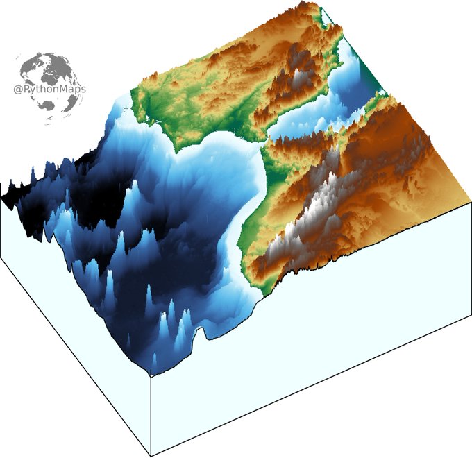
3D digital elevation model of the strait of Gibraltar for day 11 of the #30DayMapChallenge .
This map was made with #Python using #Numpy, #matplotlib and #earthpy. #data #DataScience #data #dataviz #DataScientist #eu #geography #artwork #art #Gibraltar #Brexit


Our Black in Data Viz lineup is straight 🔥 led by @ahobby9, @ajstarks, @IllestPreacha, and @SotiCoker!!
Register today!!! https://t.co/Wa9TtlJ4FN #BlkNData #DataViz #BlackTIDES #DataScience #DataAnalytics #BlackTechTwitter


Part4: Today it's time for relative humidity changing throughout the year.
Mean monthly relative humidity, calculated from #dewpoint and #temperature (1981-2020) #ERA5
created with #geemap and #EarthEngine.
The scale is non-linear for better #visualization.
#dataviz #EarthArt


Strong #dataviz small multiples vibes here, with grids of sloped bars... #generative #grids #creativecoding #creativeconvalescence #processing


Wes Anderson's new film @french_dispatch features most of the actors who appear regularly in his films!
My new @tableaupublic #dataviz shows his favorite collaborators + their roles.
Interactive: https://t.co/DDuZEXfHev
Thx @ShijiaWendy, @FlerlageKev, @flerlagekr for tutorials

Topography map of the greatest country in the world... Ireland. Colours correspond to the national flag obviously.
This map was made with #Python using #Numpy, #matplotlib and #Pandas. #data #DataScience #data #dataviz #DataScientist #Ireland #eu #geography #artwork #art

Contour line map showing the topography of Great Britain. Zoom in!
This map was made with #Python using #Numpy, #matplotlib and #earthpy. #data #DataScience #data #dataviz #DataScientist #uk #gb #eu #geography #artwork #art


We published a new Data Vis Dispatch yesterday! It's our weekly collection of the best of small and big #dataviz. Have a look: https://t.co/AMWOTPgQGZ
In the thread 🧵below, I show screenshots of the four visualization-heavy articles that impressed me the most this week:


Examples of #ETH & #CAKE @CoinMarketCap data as #OpenSeaNFT #dataviz #creativecoding here: https://t.co/kEwAXOSlKX. That's the tweet.


Hi, I'm Fiona (aka Visualizing Science), visual #scicomm whiz ✨ I provide range of services from layout design to infographics to illustration. Making info accessible and understandable. #sciart #illustration #infographics #dataviz #layout #graphicdesign #creative #editor

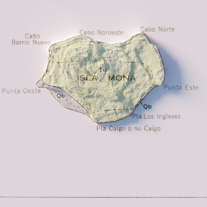

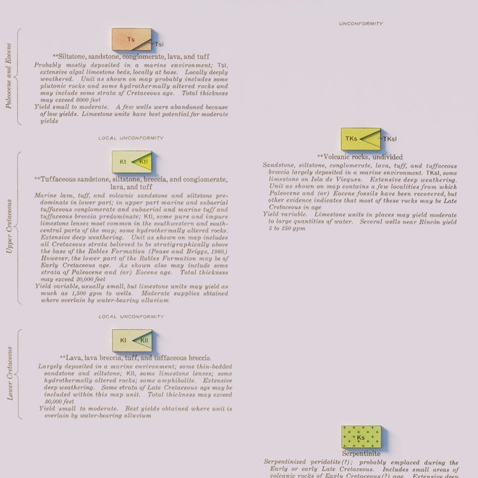
Hydrogeologic Map of Puerto Rico and Adjacent Islands - USGS - 1965
#arcgispro #b3d #PuertoRico #geology #geography #GIS #dataviz #cartography

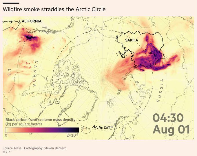
This week's climate graphic is on Siberian wildfires and how the smoke from these blazes straddled the Arctic Circle in August and led to the highest carbon emissions on record
Read @lesliehook's fascinating report
https://t.co/aAw3cZbf17
#gistribe #dataviz


Our latest Data Vis Dispatch is now out! Tune in this week for some interesting elections charts 🗳 coming from Canada, Argentina, Germany, Hong Kong, and California, some #dataviz on #covid19 🦠, and long term climate data:
https://t.co/xYklUchQ5M


Super fun team building at @fathomdata producing generative art. I used the {jasmines} package from @djnavarro to create:
#rtistry #dataviz #teambuilding


"World Stars"
New collection on @hicetnunc2000 based on a #dataviz showing how a country is doing (based on certain metrics).
I do seem to find myself often (always?) inspired by space for my visuals ;) 🌟
https://t.co/9xwR6r5nTf
#NFT #NFTart